The main functions on ChungHua official website are selling mobile phones and wireless service. However, users could barely complete the process due to unclear information architecture and flow. I redesigned the website's journey to improve their experience.
Co-design Team
Four designers in total simultaneously worked on this project. Care to adhere to a design system and version control were vital to our success.
Research & Discover
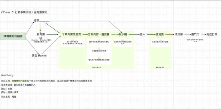
Q: Why The Conversion Rate Was So Low?
We spent a lot of time to understand how to apply the plan at first. Then, I tidied up all pages and flows, and concluded the main three problems the old website suffered from:
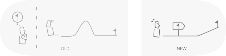
Problem 1: Difficulties at The Beginning
It took too much user effort before price information was displayed. They had to fill a bunch of forms to see the list of plans.
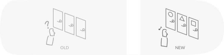
Problem 2: Crucial Info Buried in Deep
The most important information in a plan is mobile network data. However, it was in an inner page, which made users "click and check" over and over.
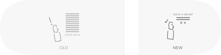
Problem 3: Too Much Text
Dialogs in the old website were full of difficult text. It's shocking in a dialog which interrupts a user's original intent.
Design
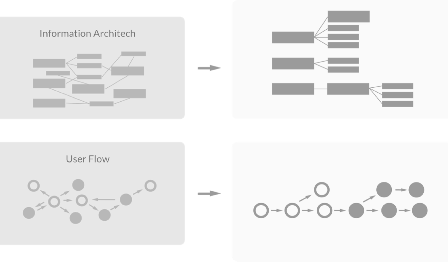
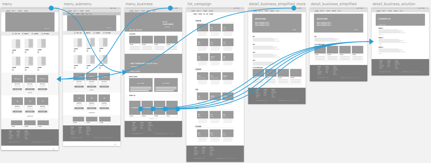
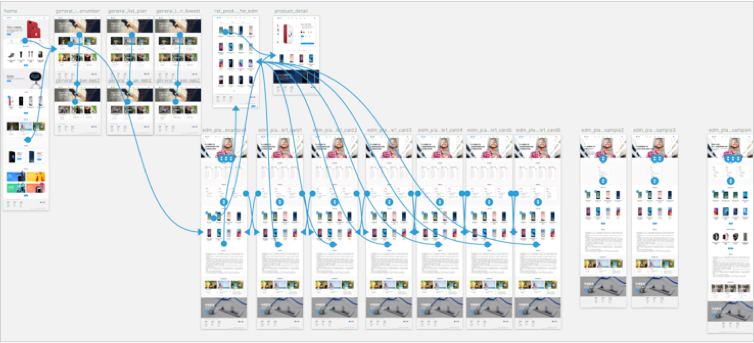
Flow Chart + Wireframes
User Experience Visualization
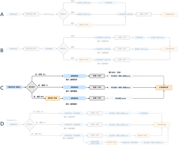
I designed multiple client flows for selection demonstrated with a flow chart and low fidelity prototypes. Once a flow was selected, I would create one in greater detail. It’s a state diagram of the interface.
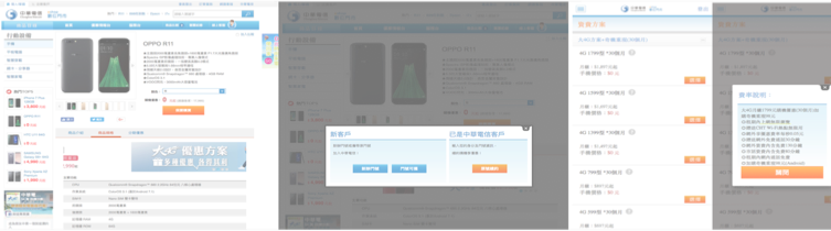
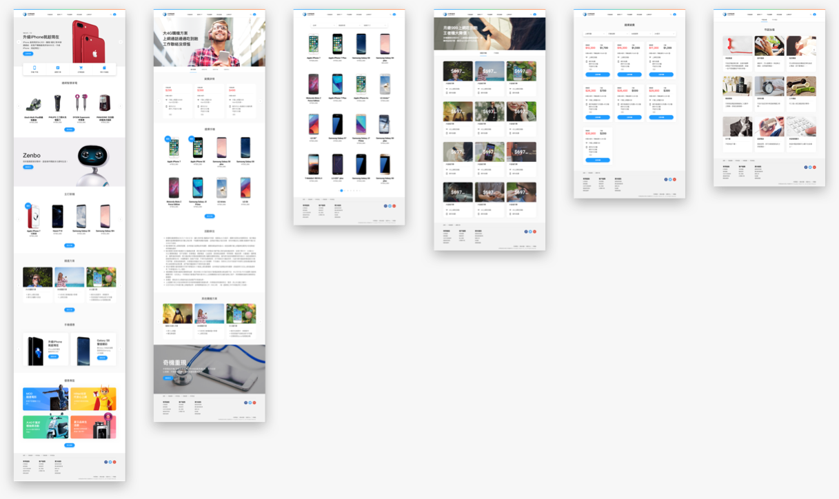
Final UI
Built in cooperation with Winnie Chu, Amy Li, and Yuka Chiu
Validation
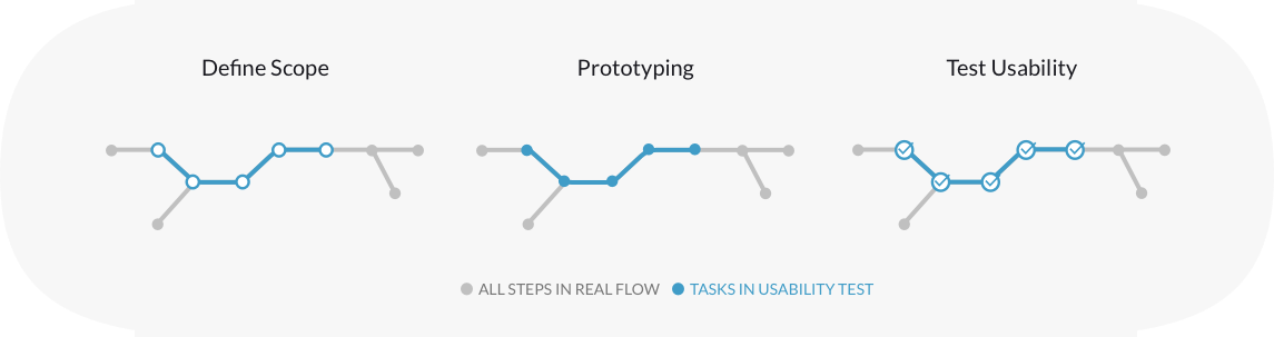
Scope Define
Cut a Slice of Journey
I designed the validation scope according to reasonable number of screens in prototype and viable result.
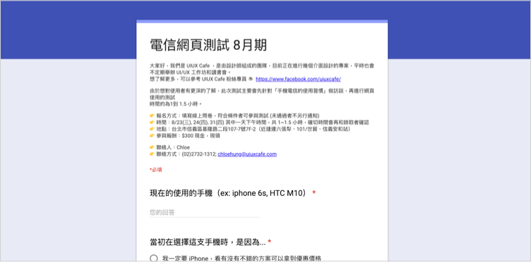
Recruit User & Prototyping
Make The Movie Studio
I recruited suitable users(persona) for target test flow through a questionnaire. While I was arranging interview time log, we made prototype. At first time, one of UI designer and I made prototype with Framer. It took much more time than we thought because Framer’s high-fidelity feature. So we decided to use lower fidelity prototype tool (InVision) unless certain page need to validate detailed interaction.
Interview & Test Usability
Face Real Potential Users
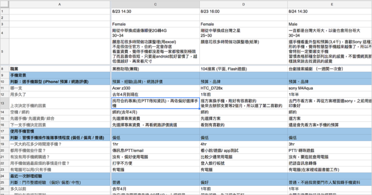
I conducted the 1 - 1.5 hour usability test. It includes background questions so we could get to know WHY user stuck in certain task. In plan apply journey, I think phones, habit of choose plan, and amount of mobile were most important variations. Though I only interview less than 30 people for the plan apply journey, I could tell a roughly personas through their behavior pattern and background. With the connections between personas and their behavior on website, we had more clue when making decisions.
Iteration
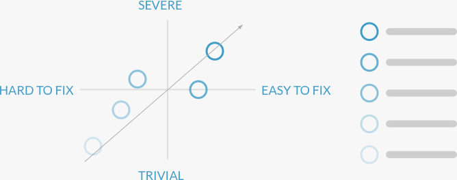
Prioritize Issues
Do Not Bite off More than You Can Chew
Optimizing user experience is an endless job. So we had to prioritize issues, fix what could be fixed, and enter next phase.